Frontier: A New Look For How We Actually Work
We’ve updated our brand at Frontier. New look, clearer story, same focus: helping marketing teams use creativity, media and AI to get better outcomes.
Rather than a big “rebrand manifesto”, this is a practical look at what’s changed visually, how we now work, and what it means for our clients.
A Simpler, More Honest Identity
We’ve dropped “Media” from the name and moved to a cleaner, more flexible identity system.
The reason is simple: we’re no longer just a media shop. Most of our work now sits where strategy, creative, media and AI meet. The old brand didn’t really say that, and it sometimes boxed us into conversations that were narrower than the work we were actually doing.
The new identity is built around a small number of decisions:
- Clear, straightforward typography that’s easy to read and use across decks, product and campaigns.
- A tighter, more modern colour palette that feels calm and confident.
- A fluid, molten visual layer that reflects how we shape and combine ideas.
Nothing is over-designed or requires a 40‑page explanation. The system is there to support the thinking and the work, not compete with it.
The Molten, Liquid Layer
The most noticeable change is the molten, liquid visual language.
This comes from how we actually solve problems with clients. We take different inputs – data, brand, media, AI, lived experience – and melt them together into something that’s simple and useful.
In practice, the liquid forms show up as soft, flowing shapes that feel like ideas moving and merging. We use subtle metallic depth where technology and creativity meet, to hint that there’s more going on under the surface than a flat graphic.
Crucially, these fluid elements always sit inside clear layouts, not on top of them. The structure still matters. You should be able to scan a slide or a screen and understand it quickly, even if you never notice the design details.
We use this layer sparingly: in a transition, behind a key message, or to guide attention. It’s there to suggest ideas being tested, mixed and refined – not to turn everything into a special effect.
Human Creativity + AI, In Plain Terms
The new brand also needs to reflect how we work with AI.
We use AI across our workflow to explore directions, test variations and work with data. It helps us get to stronger options faster, and it gives us more to choose from. But it doesn’t replace people.
There’s always an expert making the call about what matters, what gets cut and what actually goes live. That might be choosing the three routes worth developing out of thirty, deciding which signals in the data to trust, or knowing when a “nice” idea doesn’t actually solve the problem.
Visually, that balance shows up in the tension between the fluid, AI‑hinting elements and the calm, structured base. In our language, it’s about talking about AI in plain terms: a useful part of our toolkit, not the whole story.
If you work with us, you should feel like you’re talking to real people who understand your brand and your category – and who also know how to use AI properly behind the scenes to make the work better.
Knowing Which Levers To Pull (And Which To Ignore)
A big part of our edge at Frontier is knowing what not to do.
Most marketing teams don’t struggle because they’re doing too little. They struggle because there’s too much in play: too many messages, too many formats, too many “we should also…” ideas.
We’ve built our brand the same way we like to build plans: focused.
A small set of core elements that can flex across channels.
Clear decisions about when to turn the molten layer up or down.
Room for the content and results to sit in the foreground.
This mirrors how we work with clients. We look at the full picture – brand, media, creative, data – then decide which levers are actually worth pulling for the outcome you want. The rest is noise.
If something is in the work or in the brand system, it’s there for a reason. If it isn’t helping, we leave it out.
How The New Brand Shows Up Day To Day
You’ll see the new Frontier brand in a few key places.
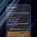
On our website, it’s there in the way pages move and content reveals itself: controlled use of the liquid layer, clear hierarchy, no unnecessary friction.
In decks and strategy work, it’s mostly playing a support role. Simple layouts, straightforward typography, and small, intentional uses of the molten language to signal key moments. The aim is that you can open a deck and follow the story without feeling like you’re reading a design exercise.
In campaigns and collaborations, the Frontier layer is flexible. Sometimes it’ll be almost invisible because the client’s brand needs to lead. Other times, where there’s room and it adds value, we’ll bring the molten concept forward to help tell the story.
Internally, it gives the team a shared visual language and a reminder of how we want to operate: fluid where it helps, structured where it counts, always clear on what we’re trying to achieve.
What This Means When You Work With Us
Practically, the rebrand doesn’t change our core focus. We’re still here to help marketing teams use creativity, media and AI to get better outcomes.
What does change is the way that story is told and experienced:
It should now be clearer that we sit across strategy, creative, media and AI – not in a single lane.
You should feel the benefit of a tighter, more considered visual system in every interaction, from the first email through to the final report.
And you should have a better sense of how we think: combine the right inputs, use the tools properly, and then be ruthless about what stays and what goes.
The new brand is simply a more accurate picture of how we already like to work.